Change the logo and a few nouns. How much of the homepage would still work for a completely different business?
A tidy layout and working buttons can make a page look polished while it still says very little about the business behind it. A request for a “modern, clean website” leaves most of the design decisions open.
A page can look finished before its design decisions are finished.
To show what changes with a more specific brief, here are two versions of the same fictional bicycle workshop.
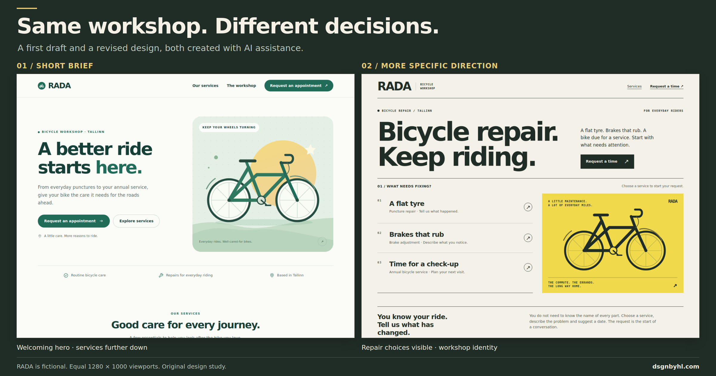
The same fictional workshop, services and appointment goal. Both screenshots show a 1280 × 1000 browser viewport. The first draft was generated from a short brief; the revision adds explicit design direction and an editing pass. Both were created with AI assistance.
What “modern and clean” leaves undecided
Those words can describe a bicycle workshop, an accounting firm, a software product or a furniture shop. They tell the model something about the finish you want. They give it much less help with the decisions that would make those websites different.
Who is arriving at the page? What problem brought them there? Which information should they see first? What real material can the design work with?
When a brief leaves those questions open, the model has to fill the gaps. Familiar layouts are one possible result: a large opening promise, an illustration, a set of cards and a final call to action. That structure can be perfectly usable. Repeating it without examining the content is how a first draft becomes interchangeable.
Anthropic has documented recurring visual defaults in its own frontend output and shown examples of how additional design guidance changes the result. That is useful evidence that the guidance matters. It does not tell us how often every model or website builder behaves this way.
Nor can you reliably identify how a website was made from a gradient or a rounded card. People use templates too. The productive question is whether the choices fit the page.
One workshop, two versions
The example uses RADA, a fictional bicycle repair workshop in Tallinn. It offers three services: annual bicycle servicing, brake adjustment and puncture repair. The visitor should be able to find a service and request an appointment.
The first brief described a modern, clean, responsive website. It specified the services and the appointment goal, but left the audience and visual direction fairly open. The full brief and both working HTML examples are available below.
Try the examples: First draft · Directed revision · Original brief and method
The resulting page is a reasonable starting point. It has a coherent green palette, readable text, a clear appointment button and an original bicycle illustration. The service links also preselect the relevant option in its demo form.
Its main headline is “A better ride starts here.” Most of the opening view supports that welcoming message and the illustration. The detailed service cards appear further down the page.
There is nothing absurd about that decision. For a brand that wants a gentle, reassuring introduction, it could be a suitable direction. It simply has not been chosen around a very specific visitor yet.
Give the revision someone to help
For the second version, the audience becomes an everyday rider who has a bicycle problem and may not know the name of the part involved.
The main task becomes: recognise the relevant service, describe the problem and request a time. The intended character is a practical local workshop, with visual cues from a printed service sheet.
That leads to several concrete changes:
| Decision | First draft | Directed revision |
|---|---|---|
| Opening headline | “A better ride starts here.” | “Bicycle repair. Keep riding.” |
| Opening content | A welcoming introduction and a large illustrated scene. | The introduction and all three repair choices fit in the captured desktop view. |
| Service labels | Annual service, brake adjustment and puncture repair. | Everyday problems lead: “A flat tyre”, “Brakes that rub” and “Time for a check-up”. The service names remain underneath. |
| Visual character | Sage backgrounds, rounded panels and soft scenery. | Paper tones, dark rules, bold type and a yellow workshop graphic. |
| Order on a phone | The hero illustration comes before the services. | The services come before the illustration. |
The underlying bicycle drawing is reused. Both pages use system fonts and self-contained assets. The difference comes from changing the wording, composition, order and treatment of the material already available.
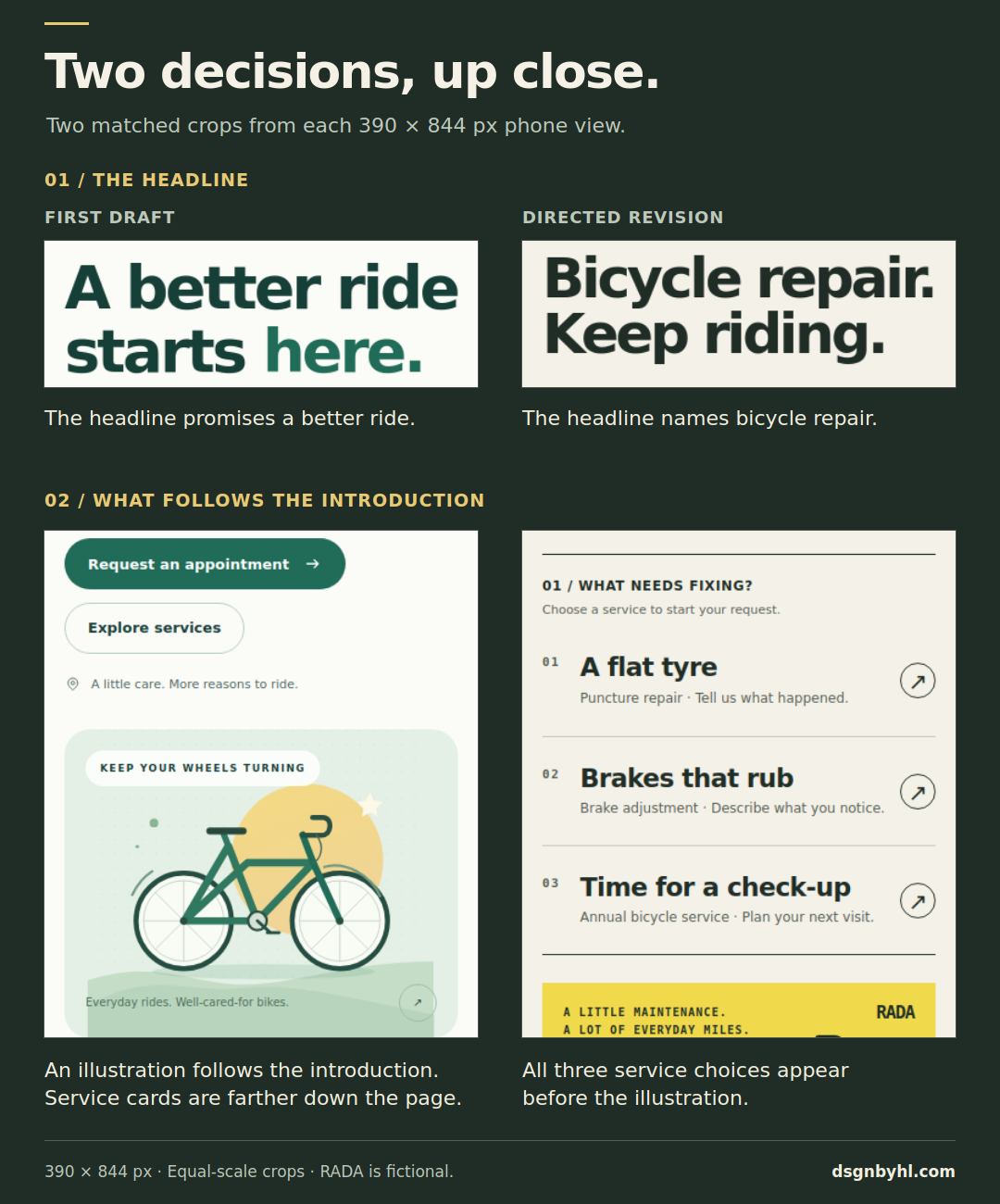
A closer view of two decisions: what the headline says, and which content comes next. Each pair uses the same crop and scale from 390 × 844 mobile screenshots. The first draft's service cards continue further down the page.
In the revised version, the service choices do more work near the start of the page. The label starts with the problem, “A flat tyre”, and puts the service name underneath. Choosing it moves to the form with puncture repair selected. The first draft already supported preselection; the revision makes that path more prominent.
This is a design demonstration, not a usability study. It shows the result of a particular set of decisions. It does not establish that the revision would produce more bookings, or that a bold yellow workshop style suits every business. RADA is fictional, and both forms only validate a demo request locally.
A different colour is only one decision
You could turn the first page orange and keep its structure intact. You would have a new colour scheme, while the visitor would encounter the same information in the same order.
Colour can be part of a strong identity. So can typography, illustration, photography, language and motion. The more useful question is what each choice contributes.
In this example, the large repair headline identifies the service directly. The three numbered rows give each service the same clear structure. The illustration shares the visual language of a workshop sheet. Those choices have a reason beyond filling space.
This is also where basic visual hierarchy helps: size, contrast, spacing and placement influence what people notice first. Nielsen Norman Group explains these relationships in its visual design principles.
For a real workshop, the next useful material might be photographs of the actual space, a clear description of what a service includes, confirmed opening hours and a real address. Those details would give the page more to say than another decorative section. They would need to come from the business; an attractive layout cannot supply them.
Keep the interactions familiar
Distinctive design still benefits from ordinary, understandable controls. A visitor should recognise a link, understand a button label and know which field they are filling in.
Nielsen Norman Group’s guidance on consistency and standards explains why familiar interaction conventions help people use a new interface. A shared component library can support those conventions while the content and visual identity remain specific to the business.
I would spend the effort on the composition, imagery and message before inventing a new way to navigate a small service website. In the RADA revision, two visible navigation links are enough. The appointment form uses familiar labels and fields. There is no need to make the visitor learn the brand’s personality through an unfamiliar control.
A better brief to adapt
Here is a reusable version of the direction behind the revision. Replace the example details with your actual audience, content and constraints.
Build a responsive website for RADA, a fictional bicycle repair
workshop in Tallinn.

Audience
Everyday riders who may not know the technical name of a fault.

Main task
Help visitors recognise the relevant service, describe their bike
problem and request an appointment. A request is not a confirmed slot.

Known content
Annual bicycle service, brake adjustment and puncture repair.
Use everyday problem descriptions alongside the service names.
Keep a direct path from each service to the request form.

Design direction
Make it feel like a practical local workshop. Use a printed service
sheet as a visual reference: paper tones, dark rules, strong type
and a restrained yellow accent. Explain the hierarchy before coding.
Reuse the existing bicycle drawing and keep the assets self-contained.

Layout and behaviour
Bring the repair choices near the start. On mobile, put the services
before the illustration. Keep navigation and form controls familiar.
Use visible labels, keyboard focus and clear validation feedback.
Respect reduced-motion preferences if movement is added.

Constraints
Do not invent prices, reviews, addresses or availability.
State that this is a fictional demo. The form must not send data
or create a booking.

Review
Render the page at desktop and phone widths. Show what appears first,
try the service links and check the form with empty and invalid inputs.
Explain which decisions serve the visitor and which are stylistic.
For an existing website, add its real components, brand assets, approved copy and technical constraints. A useful brief should help the assistant work with what is already there.
A prompt also benefits from a review loop. Once the page renders, ask focused questions: is the opening promise specific? Is a secondary section taking space from the main task? Does the mobile order still make sense? Change the decisions you can point to in the result.
Check the page beyond the screenshot
The mobile version is part of the design. In this revision, it keeps the repair choices ahead of the bicycle graphic and leaves the two navigation links visible.
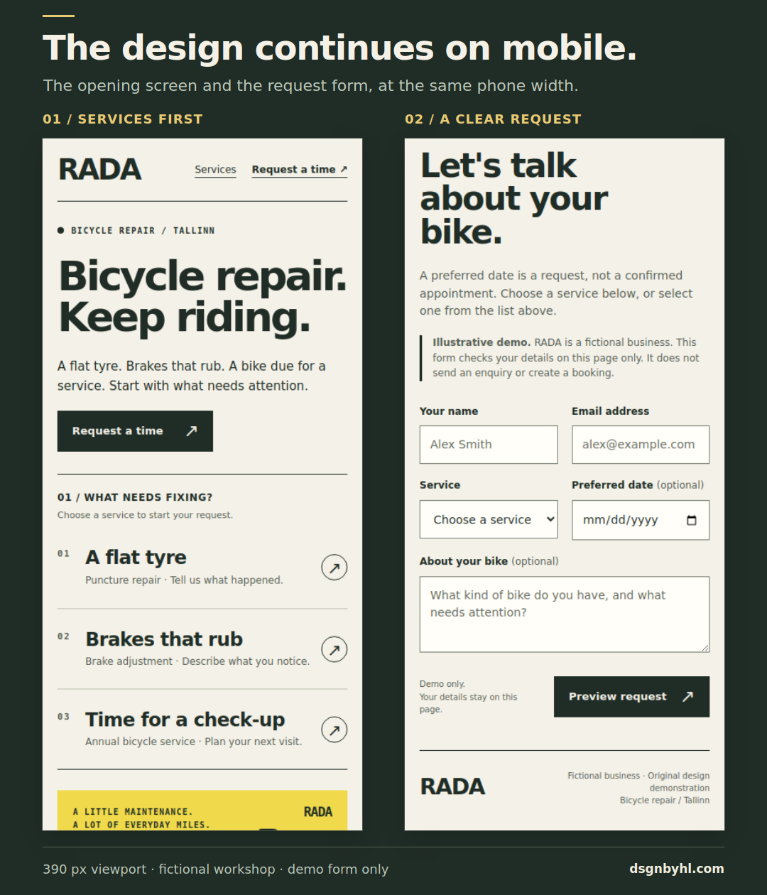
Two views of the same revision at a 390-pixel viewport width: the opening screen and the appointment section. The example is implemented in HTML; the form does not send a booking.
W3C’s accessibility design guidance is a useful starting point for checking contrast, keyboard focus, labels, feedback and different viewport sizes. A good-looking desktop capture leaves those questions unanswered.
For this demonstration, the pages were checked for horizontal overflow at several widths, service selection, basic form validation and browser errors. Those checks help inspect the implementation; they do not establish full accessibility conformance or real customer preference.
Before calling a design finished, I would also put the page in front of someone who resembles its intended visitor. Ask them to find the right service and start a request. Watch where they hesitate. Their difficulty finding an option is more useful than a general compliment about the colours.
Which decisions would you keep?
For RADA, the second direction makes the repair task more prominent and gives the workshop a stronger visual character. You may still prefer the first version’s softer tone. That is a worthwhile disagreement, especially if you can explain which customers it would serve better.
For a local bicycle workshop, would you choose the first version or the second? What decides it for you?
Putting AI to work on your website?
Choosing a model is one part of a working feature. If your business needs a support assistant, content workflow or connection to an existing system, I can help define and build the interface, integrations and checks it needs.
