Dashboard
A personal project started at the beginning of COVID, through which I spent hundreds of hours learning React. Interactive data views gradually grew into a broader personal dashboard.
- Role
- React developmentData visualisation · API integrations
- Year
- 2020
- Website
- dsgnbyhl.com
From curiosity to a working application
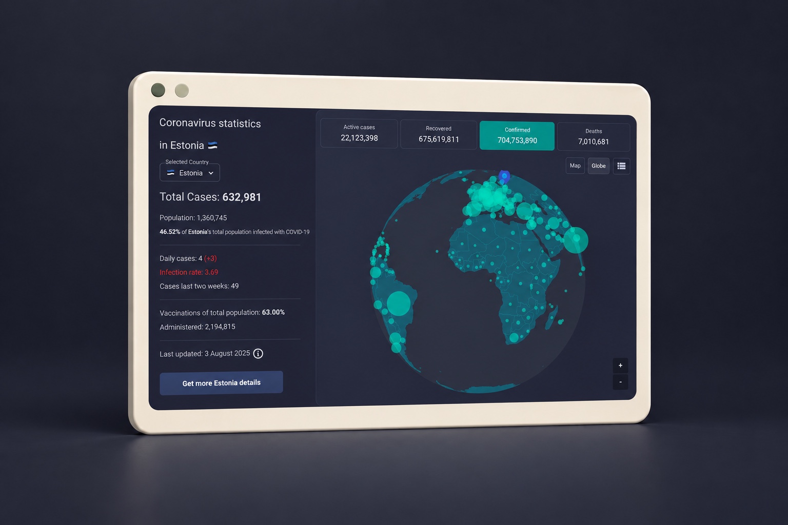
I started Dashboard at the beginning of COVID. I loved building interactive things, and pandemic data gave that interest a concrete starting point. The first version brought together a COVID dashboard and a few visual widgets for cryptocurrency and stock data.
It became a project I spent hundreds of hours on to learn React properly. Each new view introduced another practical question: how to share state between components, load data, connect a selection to a chart, and keep the pieces working together. The COVID section became the most complete part of that original idea.
One selection, several connected views
Country selection sits at the centre of the COVID explorer. It connects the statistical summary, map and timeline. Visitors can switch between a flat map and a globe, change the displayed metric, search a country table, and move from the overview into an individual country page.
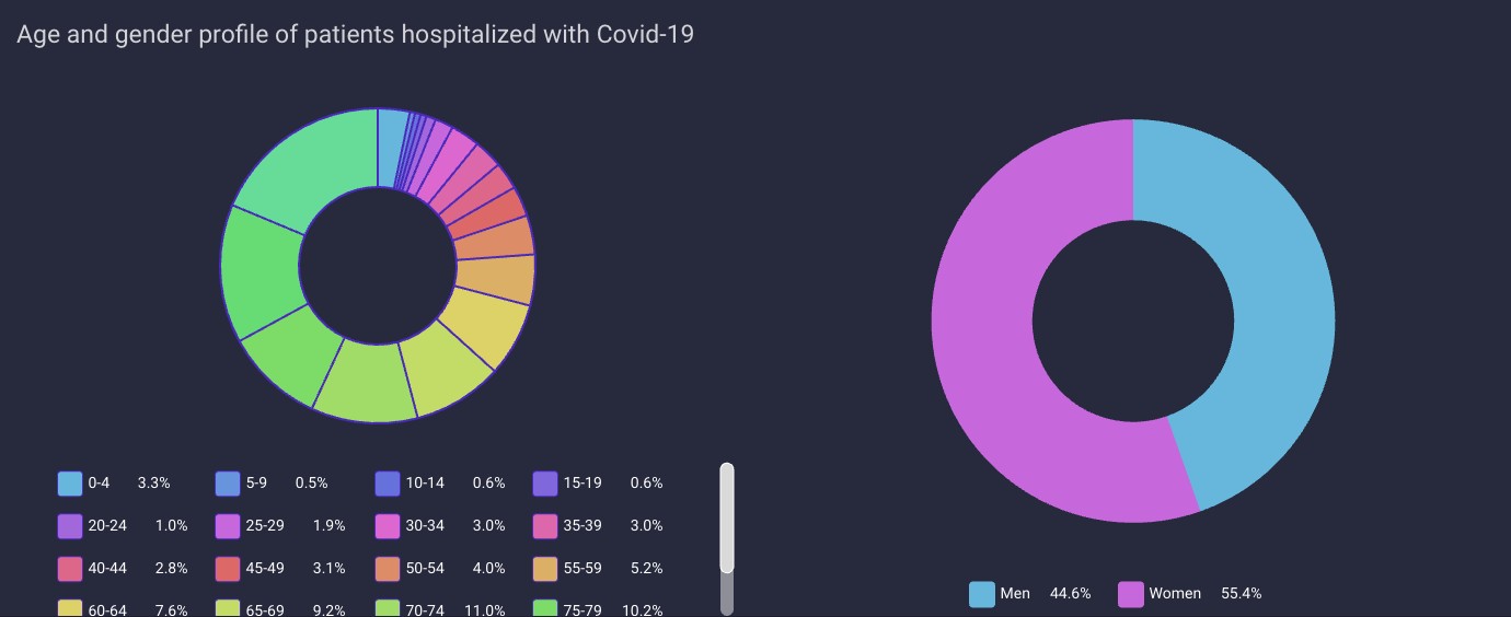
The Estonia detail view goes further, with age and gender breakdowns of hospitalised patients, a hospitalisation timeline, and regional figures. Each chart has a different job: the map provides geographic context, the timeline reveals change, and the distribution charts make the composition of a dataset easier to explore.
The work behind the charts
Connecting the pieces was central to learning React. The application combines shared state, components and lifecycle management with visualisation libraries such as amCharts and Chart.js. Creating a chart is only part of the work: it also needs to update at the right time and release its resources when a view closes.
The data needs a consistent shape before it reaches the screen. Dates must be ordered, timelines aligned by date, and missing observations kept distinct from zero. Changing country cancels the previous request so a late response cannot overwrite the new selection. A separate Node.js / Express API brings together some of the data sources; provider adapters use caching and expose stale-response status.
These are details whose importance becomes clear while building a working application. The project let me learn React through both the user interactions and the data flowing behind them.
A project with room to grow
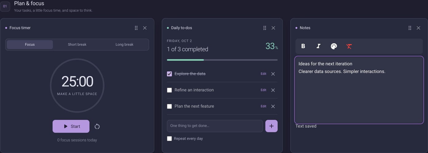
The stock and cryptocurrency views extended the original idea to other kinds of data and time ranges. The current version also includes everyday tools: tasks, a focus timer, notes, a calendar, countdowns and quick links. Tallinn departures, electricity spot prices and weather add a local layer.
Dashboard widgets can be hidden, restored and reordered within their groups. Tasks, notes and preferences persist in the same browser. That makes getting started simple, while also meaning that personal content does not automatically synchronise between devices.
Growing the application over time
The current application uses Next.js page routes while its interactive widgets run in the browser. Country detail pages have their own addresses, and the shared navigation and settings can persist between views. Larger views load independently.
A service worker saves application assets and pages for offline access. Fresh external data still requires a connection. Keeping the interface available and keeping its information current are separate responsibilities.
The COVID sources also cover different periods. Today, that part of the application is best understood as a historical data explorer. One lesson from maintaining a project over time is that a metric's meaning, source and observation date deserve as much attention as the appearance of its chart.
The most important outcome
Dashboard's value to me is how much I learned by building it. One personal idea became a working application where I could experiment, work through mistakes and develop a much deeper understanding of React.
The project brings together my interest in interactive interfaces, data visualisation and working with real data. It remains a personal development project with a public application to explore.
Results
- Learning and experimenting with React
- Hundreds of hours
- Interface languages
- ET / EN
- Project type
- Personal
Other projects
All projects